library(babynames)
library(knitr)
library(dplyr)
library(ggplot2)
library(tidyr)
library(pheatmap)Data Analysis
Load the required R packages:
Writing in Quarto part
Let’s have a look at the first couple of rows in the data:
head(babynames) |> kable()| year | sex | name | n | prop |
|---|---|---|---|---|
| 1880 | F | Mary | 7065 | 0.0723836 |
| 1880 | F | Anna | 2604 | 0.0266790 |
| 1880 | F | Emma | 2003 | 0.0205215 |
| 1880 | F | Elizabeth | 1939 | 0.0198658 |
| 1880 | F | Minnie | 1746 | 0.0178884 |
| 1880 | F | Margaret | 1578 | 0.0161672 |
Let’s create functions to visualise some of the data according to sex:
Code
get_most_frequent <- function(babynames, select_sex, from = 1950) {
most_freq <- babynames |>
filter(sex == select_sex, year > from) |>
group_by(name) |>
summarise(average = mean(prop)) |>
arrange(desc(average))
return(list(
babynames = babynames,
most_frequent = most_freq,
sex = select_sex,
from = from))
}
plot_top <- function(x, top = 10) {
topx <- x$most_frequent$name[1:top]
p <- x$babynames |>
filter(name %in% topx, sex == x$sex, year > x$from) |>
ggplot(aes(x = year, y = prop, color = name)) +
geom_line() +
scale_color_brewer(palette = "Paired") +
theme_classic()
return(p)
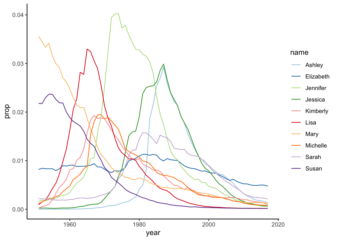
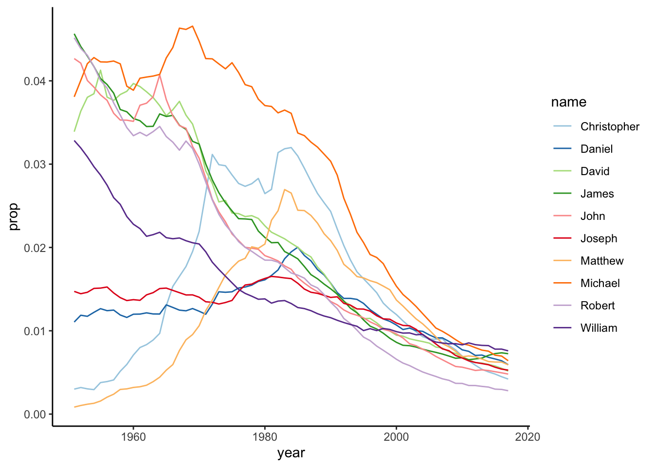
}We are going to look at the distribution of baby names over time. In Figure 1 we can see the ten most frequent names for girls. Likewise in Figure 2, we can see the same of boys.
git and github part
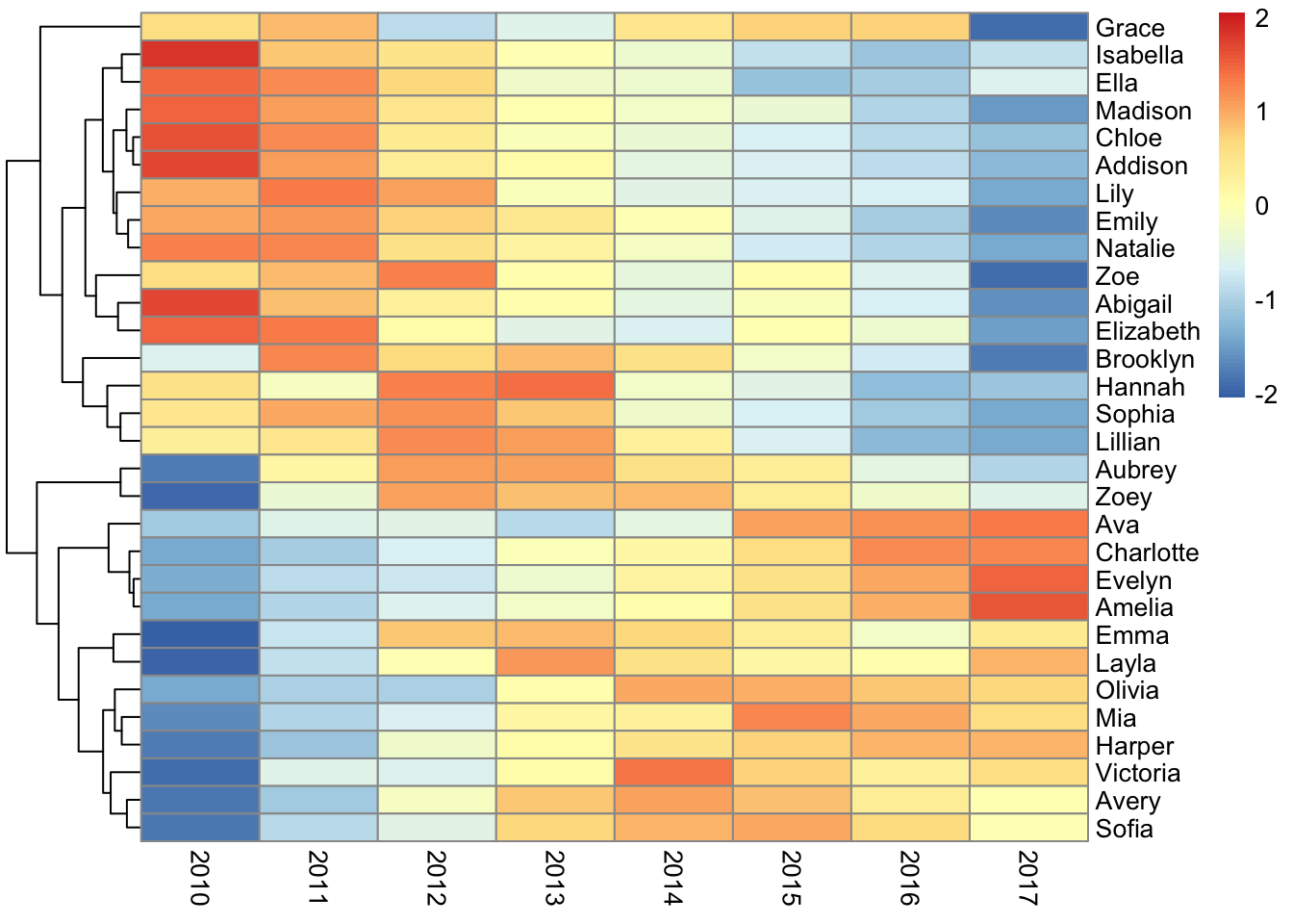
We want to plot multiple panels in a figure - an example for the most liked girl’s name can be seen in Figure 3.
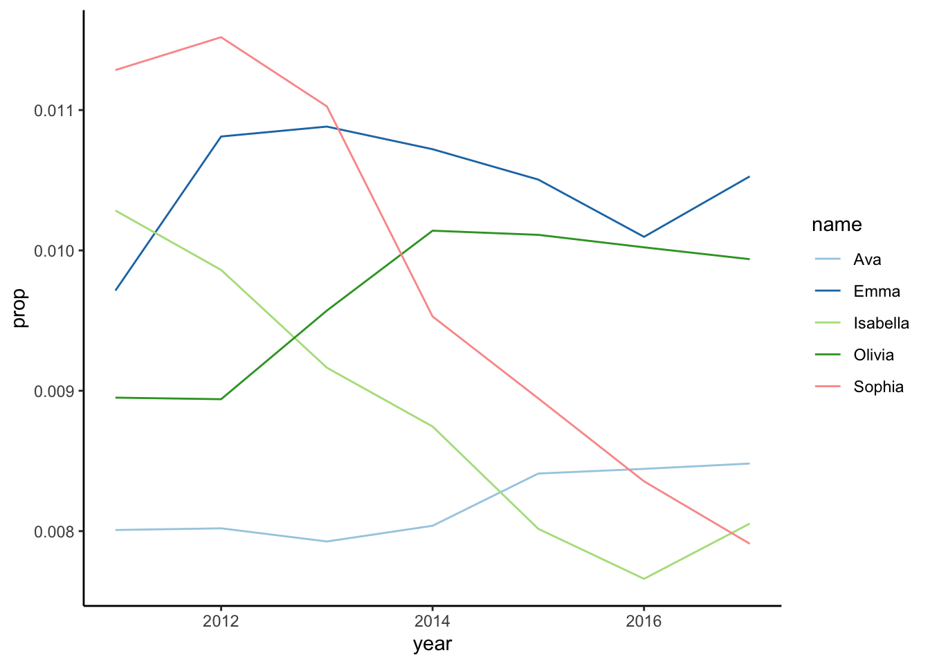
# get most frequent girl names from 2010 onwards
from_year <- 2010
most_freq_girls <- get_most_frequent(babynames, select_sex = "F",
from = from_year)
# plot top 5 girl names
most_freq_girls |>
plot_top(top = 5)
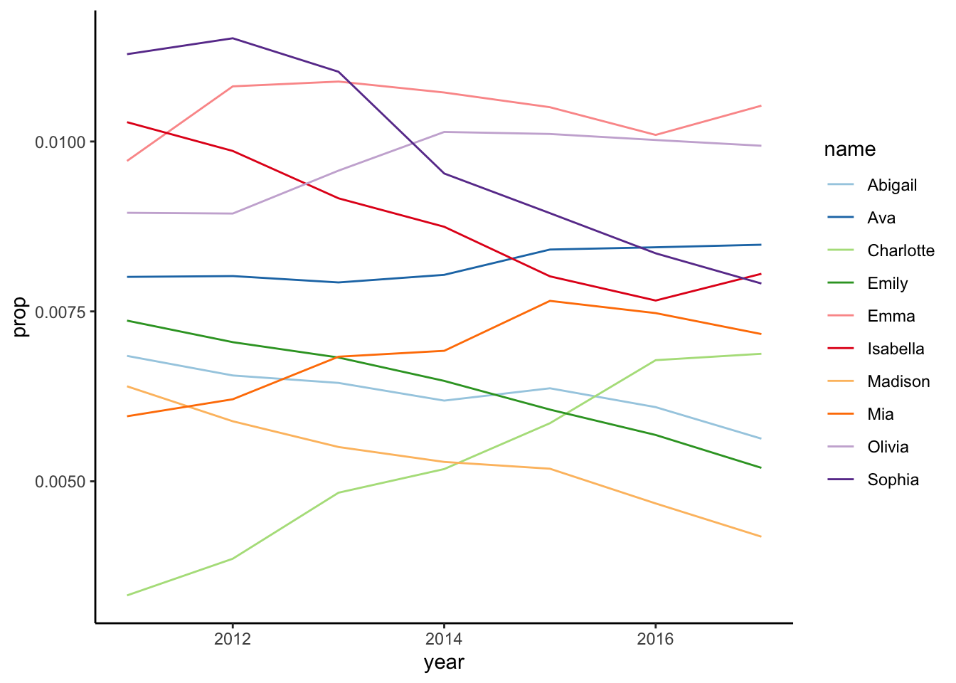
# plot top 10 girl names
most_freq_girls |>
plot_top(top = 10)
# get top 30 girl names in a matrix
# with names in rows and years in columns
prop_df <- babynames |>
filter(name %in% most_freq_girls$most_frequent$name[1:30] & sex == "F") |>
filter(year >= from_year) |>
select(year, name, prop) |>
pivot_wider(names_from = year,
values_from = prop)
prop_mat <- as.matrix(prop_df[, 2:ncol(prop_df)])
rownames(prop_mat) <- prop_df$name
# create heatmap
pheatmap(prop_mat, cluster_cols = FALSE, scale = "row")